2015-01-17 | 6506 ![]() Print
Print ![]() PDF
PDF
Planning to design a website for your company or redesign an existing one? Have you made provision for user testing for your design? Wait! you did not think it was necessary? or maybe you would rather kick out the user experience of your website out the window as well.
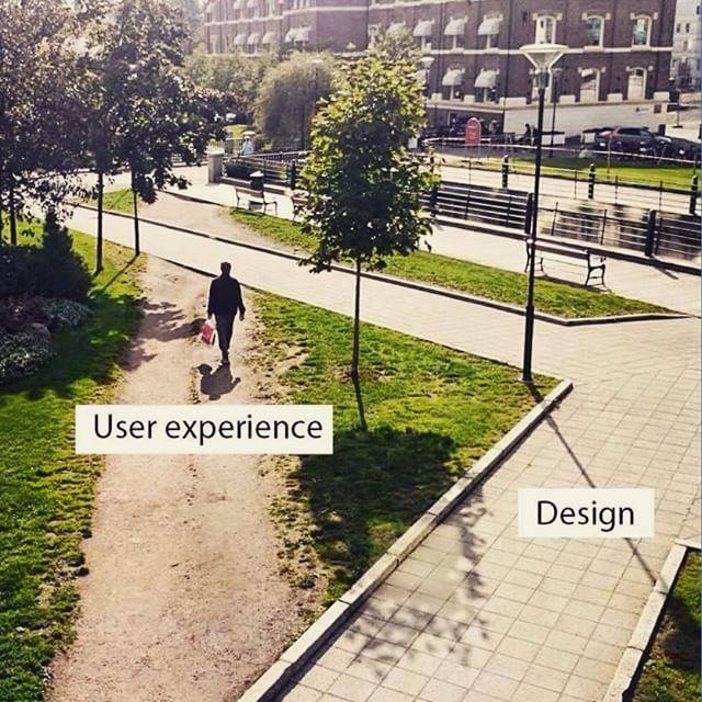
Because good user testing equals a great user experience on your site, which ultimately spells better conversion rates and sales for your site. Well for those of you that are majorly unfamiliar with the scenario of user testing I will like to shed light as to how important it is and will be using our site (SEO Web Analyst) as a case study.
This is an article that is based on our own share of design approach when trying to figure out how our web visitors may perceive our website, we needed to be sure that the right information was being passed along, and that there were no misinterpretations or ill assumptions on our part that might affect our sales conversion. So we optioned to get web visitors feedback on what they think should be changed or where a certain button needs to be placed. From your common sentence to the most obvious images, everything about the site must spell what we expect the web visitors need to do on the site once they arrive on it.
So in order to save most of your time on performing user testing to savor your user experience on your site, I have taken note of some likable recurring patterns during our user experience experiment.
QUICK NOTE ON SOME FACTS
According to Nielson, 5 key areas of usability are as follows;
1.) Ease of learning the site and how to use it.
2.) Efficiency of use once they have learned the site.
3.) Memorization or how easy it is to remember tasks on the site.
4.) Error avoidance and handling as they happen.
5.) Overall satisfaction with the use of the site.
From this rule of thumb one can simply understand that when you as an expert designer or developer could feel that you have designed the best outpost ever, this might be far from the actual truth.
I usually tell my clients (those that will listen) that when you design your site do not design it for yourself (ie to suit your taste), design it for your web visitors (with a majority not having the time in the world to spend on your site trying to grasp the meaning of all the contents you have presented them with).
Hence the reason why user testing is quite crucial as it helps to solve most technical but simple questions that might warrant why your site might have a high rate of dropout during your checkout sessions or why your web visitors will never click on your get a quote button, or even why they never visit other pages on your site.
During our own user testing, we were able to correlate 12 reoccurring traits among all the testers that visited the site and added their inputs for our continual development and improvement of the site. The testers were from 4 different sites, some were from quora reviews, user testing, usability hub, and A/B split testing sites.
You should also read User Experience (UX) Designer [Link open's in New Window]
1.) Page Speed:- Although most of the testers rarely noticed the lag in loading time for the site then, they all tend to have a first impression that their internet was slow, but not until they tried to open other sites like Facebook and Yahoo, they realize it was the site...taking time to load. The issue on how we fixed our Page speed can be read in How to Improve your webpage speed.
2.) Navigation Bar:- There are various types of navigation bars and we noticed that while most of them preferred the Fixed header (a new improvement from the old one), we had some inputs on if we could use breadcrumbs to breakdown our services, and some even wanted the type you click on and it drops down to the assigned section on the page (a single page navigation design). But due to the nature of our site and business, we could only work with the one that is most favorable to us and the majority of testers that had no issue with the current navigation bar.
3.) Page Headline:- Your website's first sentence should be headlines and should come with any of the headline tags. From our observation we noted, that was the first thing they actually readout and it was what they base their first idea of what the site is all about. Another thing to note is the font size most people are more accustomed to Arial fonts but trying new fonts can also make things pretty as long as they stand out and are not gothic or comic-like.
4.) Body Content:- Your website body content is the heart of conversation between you and your web visitors, we observed that virtually all of the testers disliked too long body content with too much information or description.
This might cause the site not to pass the right message across, and the use of ambiguous words is also another concern in your body contents. Try simple words and also reduce the use of acronyms on your site, most people might miss the use of such words to mean something else especially if they are not so familiar with such terminologies (so either reduce such usage or not use them at all).
Another content issue that always passes under one's skin is typos, as much as you would like to feel and sound professional with your website designs and other elements, your typos could actually do more damage. Most sites are subjected to minor damage here and there, but when you have a consistent flow of it on your body...it makes it hard for your visitor to understand your site (much like the use of terminologies and ambiguous words).
The type of font used and the size also mattered to the testers, the fact that they were new big font size and not the usual Arial family fonts got the tester's attention, we could not believe it caught their eyes. The use of color highlights and font colors also stood out during our test with users, as they were quick to spot out the most call to action or what we wanted them to quickly read and grasp with a few sentences in a paragraph, bolding also helped in marking our points out to the testers as well.
5.) Testimonials:- This is an old trick that actually still works, it was observed that almost all of the testers commented on the fact that they feel more assured that other people have been using the site and our live testimonial only gave more reason for them to want to check the site out further.
6.) Contact:- Testers were able to locate the contact form having the address and the inclusion of Google map made it much trustworthy that they can locate the business and it had some sort of a physical address they could track and a number they could call.
7.) Next NAV Button Action:- From observation, most testers clicked on the site Package button as their next line of action, the 2nd next navigation link they clicked on was the services. This is to show that the home page did what it should do, it got them to want to know the cost, the user got the idea if not all of it, what the site was about. So if you are making designs on your site, you should consider placing your package/pricing in a more viewable area followed by services/features since it is the next action they will almost want to click on.
8.) Package Description:- If you provide services as packages then you might want to place highlight information boxes that give a brief description of each itemized package details. Most testers requested this as a way of getting more information on the itemized package features. It provides them some reassurance that they know what it is they are exactly getting from each package price and not some random mugged-up words that rarely give precise meaning to what they are getting themselves into.
9.) Video Placement:- If you have a video on your site the best area to place this is above the viewing fold of your browsers, this means that if your videos are far below the page they will not get clicked on as opposed to if they were at the top. Most testers are so overwhelmed with trying to get the meaning of a site from the first block of content they can see before scrolling down just 3cm at most to dig in for more clarity.
10.) Static Image Placement:- From observation we realized that slider images were distractions to web users as they tend to catch the eye with their movements, and most even complained that it be better to have the images not move so different, eg having the same image slide in and out with only changing either the image itself but maintaining the size and effects. Transition time also matters as they will spend much time trying to read what they see on the image slides, so try not to frustrate them with a slide effect that will not allow them to read the content of the slide.
11.) Payment gateway:- The display of payment gateways was some sort of reassurance to the testers that they had several options of payment acceptance on the site, and the fact that we accept PayPal sort of gave them the ease.
12.) Your Site Perception:- Well this totally depends on the tester's assumptions on what they think the site is about, their first impression about the site, if they were frustrated at any point on the site, or misleading call to action, anchor texts etc.
Conclusion:- Follow these principles of user testing and develop a website that performs better with your site visitors and gives them almost all the answers they want.
If you will like to get more breakdown details on how to become a user experience (UX) designer or improve on your user experience design and user interface design, kindly get our Free ebook on UX DESIGN GUIDE.

Simply fill in the pop-up window on this page with your name and email to get the download link mailed to you, the product is in a zip file and contains over 45 pages of useful examples, data, images, and research on how you can easily and psychological design a successful user experience for your targeted audiences...PLEASE SHARE THIS POST FOR OTHERS TO BE ABLE TO GET A FREE COPY OF THIS E-BOOK.

I am a seo web analyst and have a love for anything online marketing. Have been able to perform researches using the built up internet marketing tool; seo web analyst as a case study and will be using the web marketing tool (platform).
How To Fix GA4 Showing Wrong Domain Traffic
How To Reactivate Google Adsense Account
How Do You Write Pitch Deck That Wins Investors
Effective Lead Magnet Funnel Examples For Businesses
How To Promote FMCG Products Using Digital Marketing
The Main Objectives Of SEO in Digital Marketing
How Artificial Intelligence Is Transforming Digital Marketing
Google CEO Sundar Pichai: Search will profoundly change in 2025
3 Most Important Business Growth Strategies
Top 20 Work From Home Job Skills