2016-04-15 | 4514  Print
Print  PDF
PDF
Why should you consider to have a mobile optimize website for mobile marketing? Well studies has shown that the way people browse online is evolving. Instead of surfing the net from our homes and offices we are increasingly doing so on the go using tablets and smartphones, reducing desktops and laptops for office related use. This represents the need for a major shift in mobile marketing strategy, especially for e-commerce, with the increasing trend of consumer purchase pattern causing a major breakthrough for emerging Mcommerce optimized website.
There have been data findings pointing to the explosion of the mobile web growth, and still growing as we speak, to the point it now surpass desktop usage.
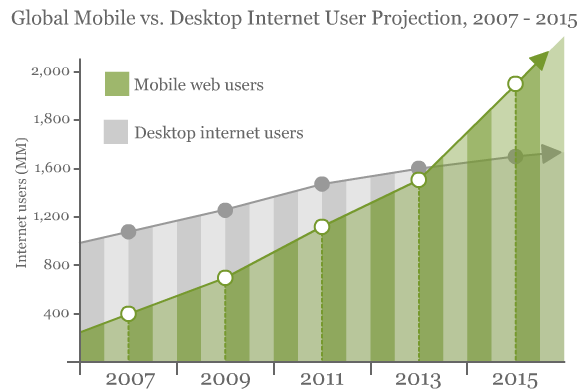
from this table above you can see the rate at which the mobile web users have easily adopted the use of internet and currently surpasses that of desktop. This alone should proof vital why your website needs to be optimize for mobile conversion, the number of traffic you will be losing if your website is only desktop friendly can be devastating. Which in turns spells a lot of potential clients you will be leaving off the table.
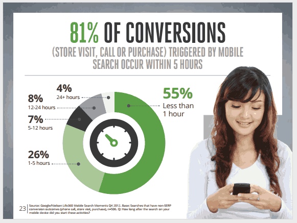
A research from MarketingLand reveals that 81% of mobile conversion are triggered by mobile search, emphasizing on the need of a mobile presence for your business.
There have also been researches that indicates that mobile smart phones are getting more higher transaction rates compared to other devices, and since consumers do have a cross device pattern of making purchases it is wise to read which channels are bringing in the most revenues (this can be read via your Google analytics). This is because most people utilize more than one device to access the internet.
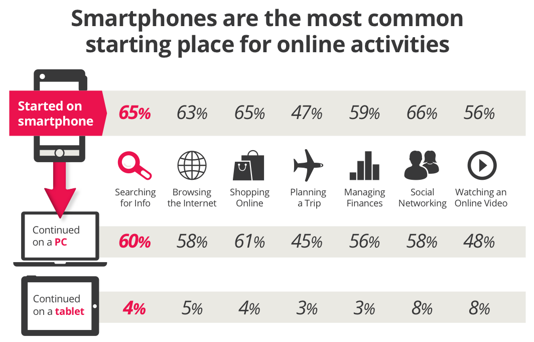
These four charts, below, from ad tech company Criteo‘s latest quarterly “State of Mobile Commerce” report explain it all.
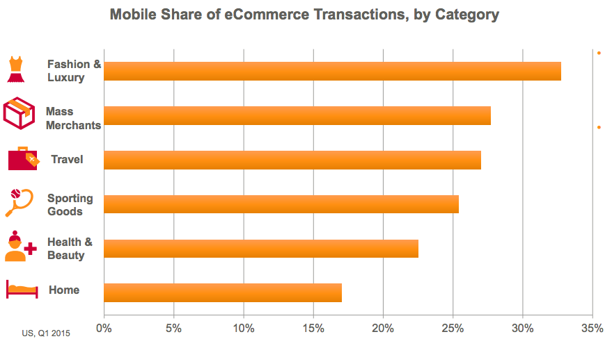
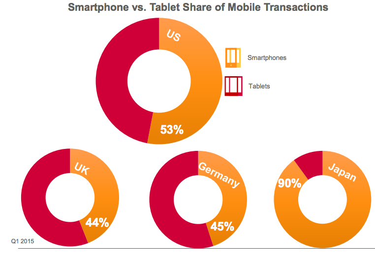
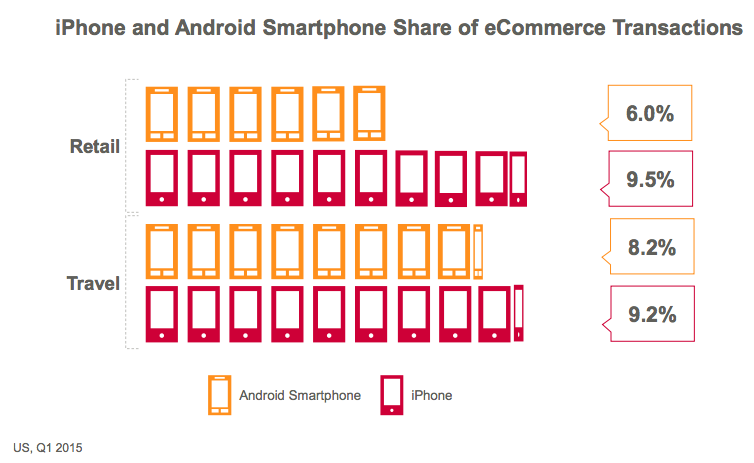
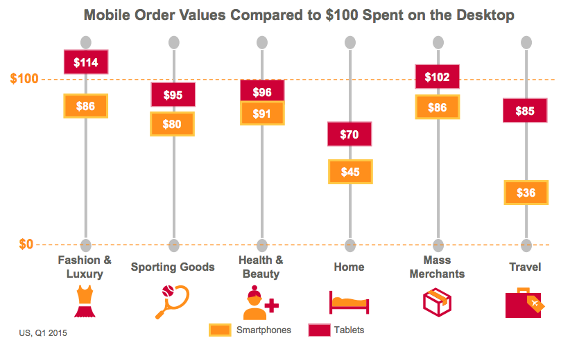
image credits:skift.com data source:criteo
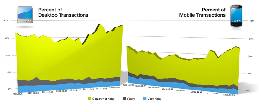
There are some factors that must have led to this growing trend, but the most observed data on the internet is that most consumers or web users are finding mobile web usage more secured and reliable. From the image below the same amount of participants were asked a survey question and base on their data, the results were compared.
latest report from NewMedia TrendWatch estimates up to 50% of hits to an e-commerce site now come from a mobile device. This figure differs around the world as illustrated in the image by criteo above, but it appeals to the need to address a ever growing new generation of consumers, it is becoming more vital to have what Web Monkey describes as a One Web Approach. This means having a universal online browsing experience, being able to access the same information, branding and design across a range of mobile devices as illustrated in the image by criteo above. So imagine if you were to target only android users, you can imagine the amount of IOS Apple users you will not be able to convert, Whether through an app or a website, it impacts on the way you optimize your website for the mobile customer, wherever they are around the world.
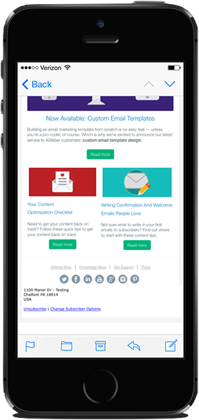
It sounds similar? using both terms sometimes can be misguiding if you don't know what you are saying. Most business websites do not know the difference between this two. I for one have heard webmasters mistaken mobile friendly website for a responsive website. Their is a big difference between the two, as one is resize able or scalable while the other readjust or rearrange its self to fit the view port or screen of your viewing device. If you still don't get the picture please view the image below by AWEBER a leading email marketing software provider, who have found the need for all its users to incorporate the use of mobile friendly template for email campaigns, if this big company can sense the need for it, then you should learn to adopt this development as well, now view the images below to have a better understand with the difference between a mobile site and responsive website.
Mobile Friendly Website
Mobile Responsive Website

Image coutersy:Aweber
Mobile Website vs Responsive Web Design (Merits and Dis-Merits)
| Mobile Site | Responsive Design | |||
| Rendering Experience |
A mobile site is essentially a copy of your website, where the server does the work to deliver an optimized page that’s smaller and easier to navigate. The solution can really customize a unique experience for mobile users. A good choice when it might be too expensive to redesign responsively. |
In responsive design, the device does the work and automatically adjusts according to a device’s screen size (large or small) and orientation (landscape or portrait). It switches between these options on-the-fly. A very good and flexible solution. |
||
| Domain Protection | With a mobile site, you must create a different domain (many companies choose to differentiate theirs by “m.domain.com”). Can dilute domain and hurt organic search traffic. Can add to website management because you have to maintain two separate silos of content. |
Responsive design lets you keep your own domain—nothing changes except code on the back-end. Googles thinks this is the better solution: ...Maintaining a single shared site preserves a canonical URL, avoiding any complicated redirects, and simplifies the sharing of web addresses... [read more] |
||
| Link Equity | Because a mobile site uses a separate domain, links shared from mobile browsers will not count as search link equity toward your primary site. Not as good for search. |
Since responsive design simply embeds new code on the back-end of your website, your company’s link equity is preserved. Better option for search. |
||
| Future-Ready |
Re-working of a mobile site might be needed in order to stay current with next-generation phones and mobile browsers.
Could require higher maintenance and expense. |
The technology is more forward-thinking because once added to site it will work on next months and next year’s devices without having to be programmed further.
A better return on your investment. |
What practical challenges and solutions does this mean you need to consider? As Web Monkey advocates design needs to be responsive, adaptive and increasingly customer-centric.
Technology and operating systems play a huge part on usability. Tech site Mashable gives tips on what to avoid. Flash, for example, does not work on Apple devices. Internationally, Apple is just behind Android, which accounts for 64% of all smartphone sales although iOS does sneak into the lead in Japan. If the majority of smartphone users in the country you are targeting use Apple devices, then if your site uses Flash they won’t be able to see it.
Drop down menus do not work well on any smartphone browser. This is partly linked to screen size as well as functionality. Similarly if images are too large they might not load well on a mobile screen, affecting the design and enjoyment of your mobile site.
The way we browse, especially on a smartphone, is different from the browsing experience on a desktop. The consumer is used to zooming in, of “pinching” the touch screen. Yet scrolling from left to right can impact on the way a consumer reads and engages with a website.
Therefore you need to ensure your website is as customer centric on mobile devices as it is on a desktop. Avoid popups, flash and ensure there is a consistency of branding. Make it as easy to view different products and information via a mobile device as it is with a mouse or touch pad at your fingertips.

Inevitably, all your customers will not be in one place.If you are targeting customers internationally, or in a specific country, it is important to understand how smartphone and mobile device usage might compare around the globe. In Japan, for example, it even has its own name; Keitai Culture defines how consumers engage with and use their mobile devices. Masanari Arai, the cofounder and CEO of Synclore Corporation in Tokyo writes in VentureBeat that because gaming is such an important part of the Japanese online and mobile experience it is worth exploring how this can be incorporated into a mobile browser.
In Japan e-commerce is ruled by mobile devices. Both Amazon and Rakuten estimate 60% of all of their purchases come through mobile in Japan. This is much higher than in the US and Europe. Analysts believe it is because the commute in Japan is largely done by train, leaving much more time for browsing. This compares to the majority of Americans who drive to work.
In Korea under half of the population owns a smartphone. Yet e-commerce here is dominated by app usage. This is because in such a small country it is easier to guarantee high data connection speeds for more people. When customers are browsing on their mobile device they are more likely to use an app to do so. Perhaps to target Korean customers, therefore, an app is better than a mobile website?
For many US brands they are keen to tap into the Chinese market – the biggest smartphone market in the world with over 330 million subscriptions. Here there is no Google Play but Android dominates iOS (although it is catching up). A factor to remember, however, is the Great Firewall. As well as blocking social networks like Facebook and Twitter it blocks “inappropriate content”. The language, content and design all need to meet the guidelines established by the Chinese government if you are to reach consumers via a mobile device.
To engage with customers around the world it is vital to have a mobile optimized website. Functionality and adaptive technology ensure the site will work on different platforms, as well as fitting with the behavior of the online consumer and taking into account trends and cultural differences around the world. Testing the site on different platforms and with target audiences is of the utmost importance ahead of launch, to ensure it works effectively and efficiently and maintains a uniformity of brand, no matter what device the customer is using to view it.
Article contribution by ebuzz.net, skift.com, smartz.com. Data source from citerio, MarketingLand, NewMedia TrendWatch Other resources; Mashable, Webmonkey, Google.

I am a seo web analyst and have a love for anything online marketing. Have been able to perform researches using the built up internet marketing tool; seo web analyst as a case study and will be using the web marketing tool (platform).
How Do You Write Pitch Deck That Wins Investors
Effective Lead Magnet Funnel Examples For Businesses
How To Promote FMCG Products Using Digital Marketing
The Main Objectives Of SEO in Digital Marketing
How Artificial Intelligence Is Transforming Digital Marketing
Google CEO Sundar Pichai: Search will profoundly change in 2025
3 Most Important Business Growth Strategies
Top 20 Work From Home Job Skills
SEO Tips and Strategies For Small Businesses
Google is making a major change to Local Service Ads


