 Print
Print Responsive Web Design or Adaptive Design: Which is better?
Since Google's algorithm update, rolled out (April 21st, 2016) targeting mobile friendly sites on the web (May 12th 2016 [as seen in the image below]), there has been some serious SERPs fluctuations with urls.
With mobile friendly sites getting more organic traffic via mobile access, Your mobile SERPs performance now affects your regular SERPs performance ie. if your mobile SERPs comes out with a good user experience and web performance, Google will ultimately improve your normal SERPs on desktop. This will make mobile responsive design one of the major ranking factors on Google.
Responsive web design has become more important as the amount of mobile traffic now accounts for more than half of total internet traffic. This major shift as made Google to announce Mobilegeddon (April 21, 2015) and began boosting the SERPs of sites that are mobile friendly, if the search was made from a mobile device. This has the net effect of penalizing sites that are not mobile friendly...statement from wikipedia.
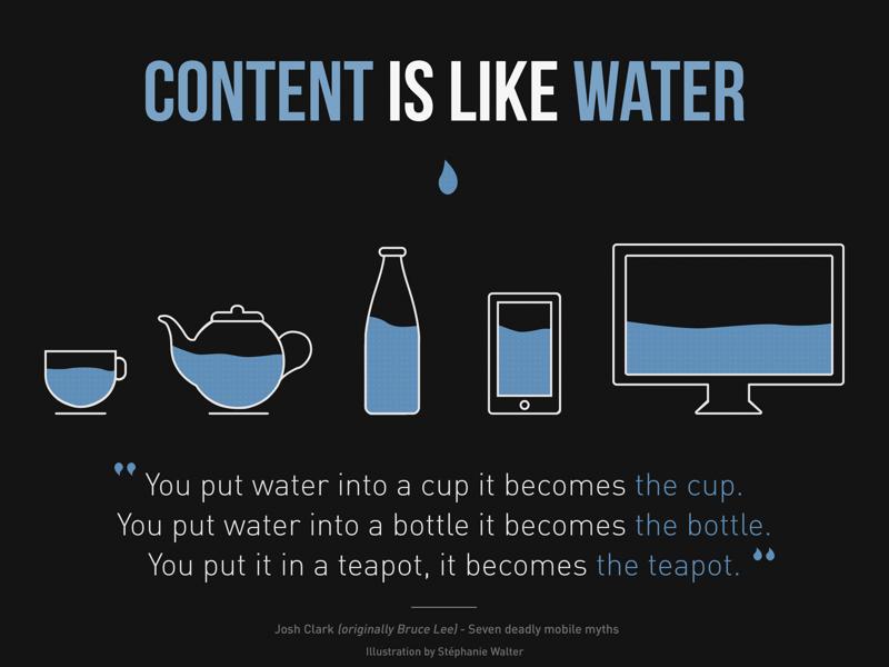
Content is like water, a saying that illustrates the principles of Responsive Web Design: Image courtesy Stephanie Walter
Google has always recommended the use of responsive web design (RWD), but they did not categorically specify the use of a responsive design, but that a site be accessible on mobile, with good UX and performance.
You might want to read: How To Become User Experience (ux) Designer. [Link open's in new window]
You might want to read: 12 Things To Do When Designing Website User Experience Using User Testing.
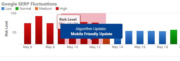 Image courtesy: Rankranger.com
One of the biggest challenges website designers face since the rise of mobile advancement is how to choose the best responsive websites design, whether you should choose to develop a responsive web, adaptive web design (AWD) or standalone mobile website design (with its own m. URL). For the purposes of this discussion, we’ll leave out standalone mobile website design sites as it appears to be the least favorite solution for designers and businesses since they must be created separately (which accrues more upfront cost and maintenance costs).
Please read more on Mobile Design vs Responsive Design via our post on Optimize Website For Mobile Marketing [Link open in new window].
Responsive Web Design vs Adaptive Design : What's The Difference?.
I will like to kick off with the most infamous mobile site design; "Adaptive web design". What is it? really! well from studio.uxpin.com they define adaptive design as a design that uses static layouts based on breakpoints which don’t respond once they’re initially loaded. Adaptive responsive web design works to detect the screen size and load the appropriate layout for it – generally you would design an adaptive site for six common screen widths:
- 320
- 480
- 760
- 960
- 1200
- 1600.
Adaptive mobile site design is useful for retrofitting an existing site in order to make it more mobile friendly. Generally, you would begin by designing for a low resolution view port up to a higher resolution view port and resolve design issues around web content.
Its more time consuming and more expensive to maintain unlike responsive design, although adaptive design tends to execute faster and render much better fluidly than responsive web, but responsive design will always be the web most popular and the best responsive websites choice. This might be due to the fact that there are no other decent solution to the heavy maintenance that adaptive demands.
You might want to read: How To Become User Experience (ux) Designer. [Link open's in new window]
You might want to read: 12 Things To Do When Designing Website User Experience Using User Testing.
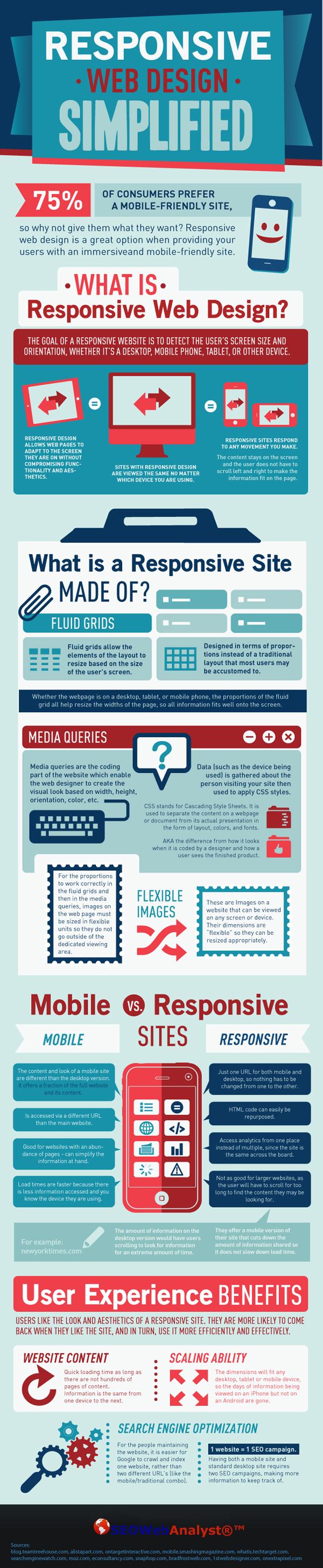
Responsive Website Design Simplified [Click on image to download infographic].
To learn more best practices for adaptive and responsive web design, check out the free e-book Timeless UX Techniques: Responsive & Adaptive Web Design.
