2016-08-21 | 3751 ![]() Print
Print ![]() PDF
PDF
There is this misconception driven by some marketers who promote or place adverts for themselves or other business about the need of getting a capture page for their advert placements. This capture page or squeeze page should be a separate landing page for your prospective target audience.
Having a separate capture page for your online ad campaigns is very crucial, we should stop assuming that our regular home page or featured page will be able to convert our website visitors.
Now there is a need to clarify things, placing adverts about your service and organically getting traffic are two different things...One thing is clear as soon as you stop advertisement your traffic drops!
So in order for you to not let hard earned money go down the drain, it is wise to not simply place advert targeting your home pages or other pages that are part of your business website.
Instead provide your target paid audience with another landing page, most preferable a squeeze page where they need to enter their details to actually signup for your real product or a demo.
You should link both forms database so that if they signup on the landing page they automatically get registered for your main website...during this period you might want to offer your audience a free ebook on how they can better their issues with your product solutions.
All that said, we should now be able to focus on the main topic of the day...which is "How To Create Capture Pages That Converts Like Crazy", for a better anatomy of this topic I will be using C.O.N.V.E.R.T.S as a means to convey the information in a much simpler manner.
You don’t want people to just visit your page. You want them to take action once they are there. Hence, making it as easy and compelling as possible for them by adding these elements found on landing page that CONVERTS:
Clear Call to Action
The call to action (CTA) is what you want visitors to do: Shop Now. Sign Up. Try It. Contact Us. See Our Video. You need to make this a priority when creating your landing page. Whatever it is you’ve decided as your goal on your landing page should move people along your conversion funnel. That’s what they should be seeing, clearly and temptingly, to do. Don’t distract them with lots of other requests. The best pages accentuate only one CTA.
It should be placed in strategic places on your landing page, such call to action might be words among the content of the page. This will make it more persuasive when your target audience see the same word on your button.
Some other areas to consider in a CTA is the sentiment choice of words, I for one totally prefer a mix of words that are verbs. The use of bigger or bolder fonts to describe your call to action is also legible, the use of arrow buttons, italic graphics etc can also be used on your CTA word.
Offer
An offer is anything you give your visitors in exchange for getting them to do what you want. This is a no brainer, in fact it is always a win win scenario, where by you offer to giveaway valuable items that are deemed of high end need to your visitors in exchange for their details. Most landing pages do offer such in terms of trials, demo, freebies, discount coupons, etc.
When creating your capture page their should be room for offers that are actually related to the main offer you are presenting on your landing page. Whatever you offer, try assigning it with a duration or quantity to create a sense of urgency to spur a response or you can create your offer in relation with your call to action.
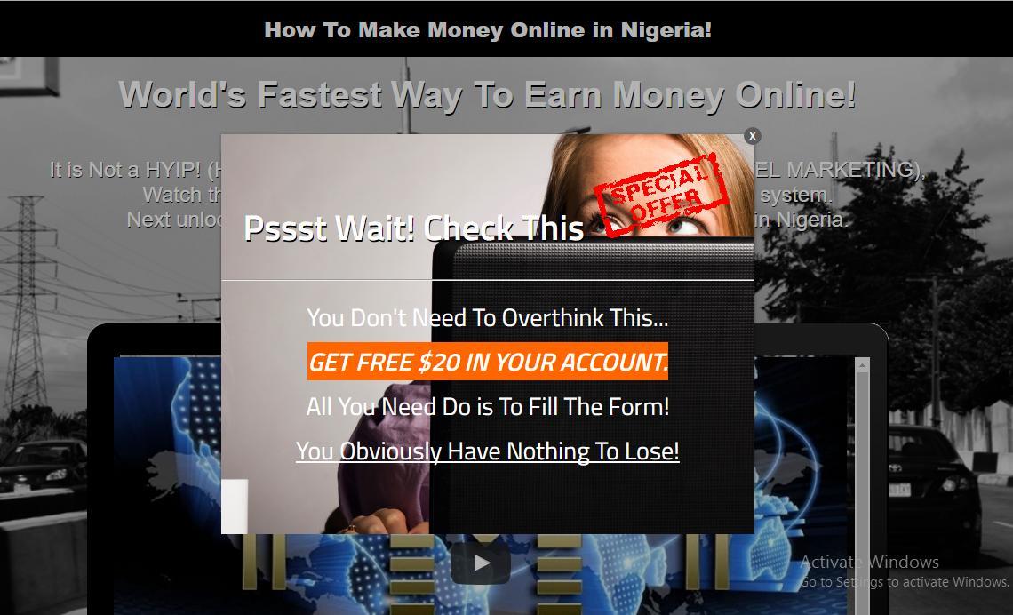
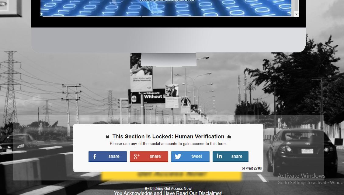
There are means you can incorporate an offer to your landing page, and most suitable is to use pop up windows, if you want to place offers on your landing pages then make it be in correlation with your call to action goal.
Navigation
This area seems to be the most simplest, but yet most difficult to perfect. Research has shown that the more choices you offer people, the longer they take to make a decision. So the clearer and simpler you make your page, the more likely you are to get someone to take the action you want.
Now when I made mention of Navigation what I mean is your web visitors reading span habit when they land on your page. Now most web visitors do have a very short duration on pages, so its best to always make do of every second that they use on your capture pages.
You can easily do this by removing unnecessary elements that will distract your web visitors, things like navigation bar, several offers, long prepositions or essay instead of going straight to the point. Most people do not like to be yanked or over pitched, the worst scenario is to turn your capture page into a sales page.
Another thing to point out is the use of forms, when you want to design a capture page you should try as much as possible to only collect the data that are most crucial to you, and stop using forms that look more like a survey form. But if you need to collect as much information then make use of a short landing page with less content, replace the lack of content with a video presentation or information.
Very Important Attributes
The very Important Attributes are the striking elements of your capture page that resonate around your offer. This VIA's are mostly listed out as benefits, features, or consolation attributes that your web visitors are seeking for.
it’s a general believe that you should describe your product/service from the customer’s point of view. In other words, explain what problems your product or service can help solve.
Make sure the list of attributes doesn’t distract from the CTA. You might tease attributes above the fold, and then locate fuller descriptions below the fold. And setting attributes off with icons or pictures can make a list more visually appealing and friendly.
Effective Headline
According to Peter Koechley, the Co-Founder of Upworthy.com, “The difference between a good headline and a bad headline can be just massive. It’s not a rounding error. When we test headlines we see 20% difference, 50% difference, 500% difference. A really excellent headline can make something go viral.”
Now from (UX) user experience point of view, your headline is actually the first thing any web visitor will want to see and it should be simple enough to summarize all what your page is about in one sentence.
Your headlines should be in bigger fonts than your regular font size in your body, your headlines should actually be place in your header or should be the first sentence they read. Placing headlines in this sensitive areas will reduce your audience losing focus on what is what on your landing page.
I prefer to use click bait techniques for headlines, as they are highly creative ways to get audience to want to read more by scrolling down.
You can read more on How To Build A Clickbait Empire
Re-engage
Re engage your website traffic with pop up windows! it's no secret that most web visitors will not convert, and the need to persuade further is now a perquisite for landing page conversion.
There is hardly a webpage online you will not see one form of pop up or the other offering you a give away incentives for your email address. When designing your landing pages including a pop up window is a logical thing to do, with pop up windows you can easily re-engage as it helps to secure the lose traffic that visit your site with a special offer or an incentive that is a part of your product bundle.
Your pop up window should concise with your product offer and not stray away from the goal of your call to action or you might defeat the purpose of your CTA.
Template Design
Your landing page design speaks volumes, I mean with all the changes going around, it will be unwise not to design a landing page that is mobile friendly. But this aside, landing page design should have it's aesthetical appeal, if your landing page looks like an official website then it lacks the efficacy of a landing page that can convert.
The essence of having a landing page in the first place is not just to capture your audience with over loaded information or content, but you can actually use the landing page to test your design skills, with sleek designs that will probably not be allowed on your official website.
Be creative with your template designs, you can use all sort of design elements to try and make your landing page more fun, make sure your designer knows which area on your landing page are the most important elements on your page and puts them front and center.
It is always best to have your entire landing page fit on your audience screen, without them scrolling down excessively to read the rest of the content on your capture page.
Social Proof
Having a social backed captured page is very persuading, because it reveals that the capture page as been visited and referenced by others. As minute it may seem, social proof is also a converting signal.
There are various ways to implement social proof on your landing page. You can use Like or share buttons on you capture page of respected social media sites.
Offer the need for your website traffic to utilize social proof is another way to increase referral traffic and leverage the traffic visiting your capture page.
When your website traffic audience perform social share activities on your landing page, they also share your url on their walls. Their followers or friends are bound to see it and does interested will certainly click on the link.
This round up my post on Landing pages that converts, but if you are having issues trying to design a capture page or landing page that converts with all this attributes, you may want to check our Landing page demo.
Recommended INTRODUCTION TO SQUEEZE PAGES: What are Squeeze Pages?
Recommended The Difference Between SQUEEZE PAGES And LANDING PAGES

I am a seo web analyst and have a love for anything online marketing. Have been able to perform researches using the built up internet marketing tool; seo web analyst as a case study and will be using the web marketing tool (platform).
How Do You Write Pitch Deck That Wins Investors
Effective Lead Magnet Funnel Examples For Businesses
How To Promote FMCG Products Using Digital Marketing
The Main Objectives Of SEO in Digital Marketing
How Artificial Intelligence Is Transforming Digital Marketing
Google CEO Sundar Pichai: Search will profoundly change in 2025
3 Most Important Business Growth Strategies
Top 20 Work From Home Job Skills
SEO Tips and Strategies For Small Businesses
Google is making a major change to Local Service Ads