 Print
Print 7 Tips On How To Improve Your Website Design
Have you been puzzled with the idea of what to design and how to design your website for your business? Mostly you are always required to provide the pieces of information required to design your website to standard.
If you follow the layout 7 Tips on how to improve your website, you will find it very insightful and help you with the guidelines to design a website that correctly represents your business online.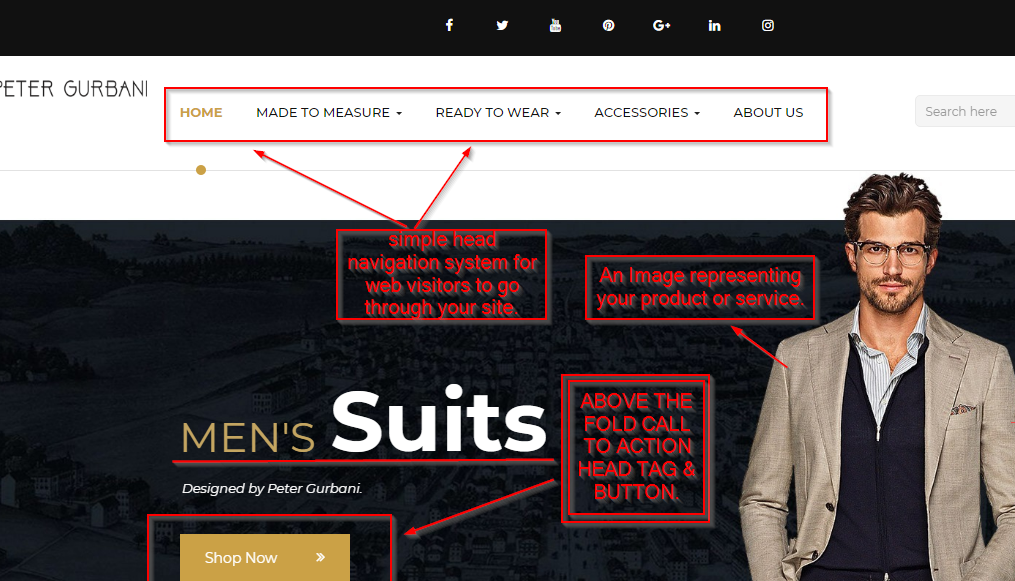
How to improve my website.
- Have a Simple Plan Layout
- Avoid non-related imagery and ambiguous terminology
- Include social share and follow buttons
- Always implement calls-to-action above the fold
- Make your site navigation system super easy
- Always avoid lengthy scrolling on your website
- Stay mobile friendly
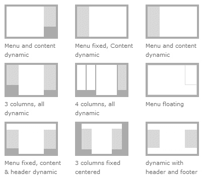
1.) Simple Website Design Layout
The first thing to look at is the layout of your website, you need to make it simple and easy to navigate around, a simple layout design can make the difference when designing your website.
So when you are scheduling a meet up with your website designer, you should make sure both of you are on the right page when it comes to design layout, they can give you samples of websites or a wireframe image of what layout they tend to utilize for your website design.
2.) Avoid non-related imagery and ambiguous terminology
The use of images on your website are very important and also should not be taken for granted when implementing them on your website. Especially uploading images that do not correlate with your website services or contents, most culprits for this are service provider websites.
If possible you should try to get a graphic designer to design all the images you will utilize on your website and avoid spoofing the internet with images that are not yours, this practice always backfires when you directly utilize an image from another web (source). The damage to this is simply your reputation, most web visitors that have seen the image from the web will definitely know that you have no right to designing your own thing from the scratch (zero initiatives), so how will you be able to execute their own projects or if you are basically outsourcing it and hence charging a higher fee.
3.) Include social share and follow buttons
Not most website loves the idea of adding social share buttons on their websites home page, this is understandable, but look at the bright side, with a social share button on your home page you easily get social referral traffics from those that visit your website and are impressed.
Providing a social account link to your website is also a vital aspect for a website development nowadays, so whenever you want to design your website, you should consider creating some social accounts that will link your pages to them.
Furthermore, you need to promote those pages by growing your followers and likes on the social page accounts and create contents on a daily basis to improve interaction. Nobody wants to like a page that has not been liked or followed or has not viable content on them that is engaging, both website design and social presence works hand in hand.
Though there are some businesses with a less social presence need and are not entirely suitable for some social media websites, which are classified as a business to business product/service providers... these kinds of businesses might utilize other mediums of social engagements, this can be via a blog, video creations (YouTube) etc.
4.) Always implement calls-to-action above the fold
The use of call to action button surpass just the ordinary URL buttons, but now include forms, video containers as well as.
And the best placement for this call to action figurative is above the fold of your website screen view, when your website is being loaded on a mobile phone or desktop the first entire page that is visible on the screen should contain a call to action function.
When a visitors land on your page, don't leave them with the guesswork to start scrolling through your navigation system, rather let them instinctively make the next decision by following your call to action directives, which could be to either sign up for a trial, submit a form, watch a video or any other incentive to pacify them to not leave your page same way they arrive on it.
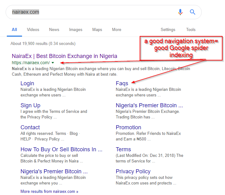
5.) Make your site navigation system super easy
This is a very broad topic but to be brief, it will be very easy if you can easily categorize your navigations and what menu should be under what. Using the parent menu's headlines as bait for your web visitors to click on for the submenu drop downs.
Now that Google indexing now easily categorized an entire website page under its search, you will notice such website presenting all their web pages under the first position search row instead of showing them separately as they use to, you will only get a thin spread of your website on Google results if you optimize your navigational anchor text and link system.
6.) Always avoid lengthy scrolling on your website
It is a great idea if you have lot's of content to offer your web visitors, but most mistakes that are done is to try as possible to showcase all in one single page. This is a bad practice, seriously I have come across some website that provides good product and tend to justify this with too much volume of content on the website, I am not so keen on reading long text so what makes you think I will read this encyclopedia of a page "I say to myself".
When designing a website one needs to realize that there are numerous ways to convey a message without overloading it on a single page, you can distribute the content wisely by categorizing them, or splitting them to other pages, pop up windows, drop down containers, Tab slides, etc.
Always let the web visitors feel like they are in control and not imposed to read all the information laid in front of them, they will certainly leave without reading 20% of your entire home page content and may not get the message.

7.) Stay mobile friendly
This is no brainer, ever since the paradigm shift of online web visitors to mobile, it is now a rule of practice to always design your website for mobile viewers. But even at this most website are not fully mobile integrated.
Here are some mobile website design tips which should be taken into considerations;
Your button should be well spaced.
Your image should be well sized and optimized.
You should reduce the callback URLs and optimize cache for web browsers on your server.
Avoid using inline java scripts or CSS on your website and load your CSS in accordance with importance.
Minimize the amount of webpage content that gets loaded on a mobile version of your website.
Use legible font sizes that are very visible on mobile devices and not obscure reading.
Make sure all of your page's links/buttons are large enough for a user to easily tap on a touchscreen. Learn more about sizing tap targets appropriately.
Compress all your website files easily from your server-side.
Your page specifies a viewport matching the device's size, which allows it to render properly on all devices. Learn more about configuring viewports.
A viewport controls how a webpage is displayed on a mobile device. Without a viewport, mobile devices will render the page at a typical desktop screen width, scaled to fit the screen.
Setting a viewport gives control over the page's width and scaling on different devices.
The contents of your page fit within the viewport, meaning that the page content must fit horizontally within the specified viewport size, thus forcing the user to pan horizontally to view all the content. Learn more about sizing content to the viewport.
Follow these 7 steps outlined above to aid you to produce a stunning and straight to the point business website for any niche.
You might find Responsive Web Design vs Adaptive Design very useful and 12 Things To Do When Designing Website User Experience Using User Testing.